This one got an award, not a surprise. I think it's truly amazing. His eyes supports Darwin's theory in hundred per cent.
This branding project is made for a coffee company. I'm not a big fan of this one. I don't really like the usage of the rounded fonts in coffee or chocolate brands. To me, it always seems like coffee branding must have an elegant, sophisticated vision. Also, don't like the logo. It looks like the designer couldn't come up with something original and just decided to put the coffee bean and make a splash around it. Don't find a strong relation between the splash and the coffee, so the whole design seems very forced to me.
Bones. Again. Think i'll always find bony designs somehow attractive. Design of this ill mannered skeleton is just fine; melting hand, the structure of the bones and the crossed red line are simply appealing.
La Cabane d'Henri is a bed&breakfast auberge in Quebec. I think Canadian designer did a great job by reflecting the warmth of the auberge by using the red color and wood. Originality of the typography catches the eye quickly, every single word plays an efficient role in the unity of whole. Nothing bothers my eye, putting A in L or writing D in a smaller way according to Henri are so harmonious with each other so that the client quickly feels the charm of the little hotel.
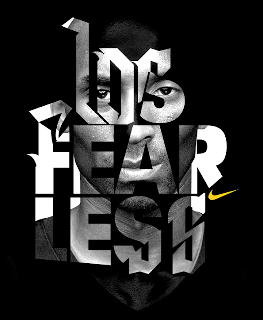
This Nike campaign with Kobe Bryant is made for the All Stars. Typography is so dynamic that it directly reflects the relentless energy of the basketball. Dynamism of the type and the calmness of the Kobe photograph balance each other in a way that deformed, in a way exaggerated typography doesn't seem too much to the eye. Yellow Nike logo is how it has to be in the first place, small, minimal, enough.
Tim Noble and Sue Webster build large scale sculptures made of haphazard clumps of discarded wood but when illuminated by a light projector create uncanilly accurate self portraits of the artists. I find this fascinating even to think about this project. Putting piece by piece and creating a figure is something so hard and requires millions of details.. Respect.
Refined beauty. Piece was created by stapling taunt strands of Egyptian cotton thread in a meticulous way. Never thought before combining millimetric threads would look this beautiful. Photographs are nice but still think that we can't understand the real depth and the sense of 3d without standing right in front of the piece.
Lastly, i put a video which was made by sound designer Diego Stocco. He carves trees and make his own custom instruments and calls this process Custom Built Orchestra. This is pure music.


Hiç yorum yok:
Yorum Gönder