6 Aralık 2012 Perşembe


http://www.behance.net/gallery/Nike-London-2012-Retailer-Hospitality/6125869
This innovative store is designed for 2012 London Olympics. Store looks absolutely amazing. When a client gets in, there's no doubt that he/she will enjoy the general atmosphere which was created through patterns and contrast of colors. Purity and transparency of white is in perfect harmony with bold red.It provides an amazing contrast between historic architecture with cutting-edge digital sport products and experiences.


http://www.behance.net/gallery/Mask/6016643

I picked those from the final work of x-presion. I do like a lot their style, they somehow manage to combine the mystery, elegance and a sense of tension. The outcome is pretty much always brings us original and intriguing photographs.


Using modified parts from an old pinball machine, the artist creates one of a kind drawing device that utilizes standard flippers to control a ink-covered sphere that moves across a temporary poster placed on the game surface. It's a freaking original idea to use a pinball machine to draw, i think the outcome could be much more fascinating with lots of color and different technics. 


These animal head illustrations are looking pretty charming to the eye. They are in a geometrical form and look a bit complex at first glance but i think they are cleverly made.


 Dutch artist Berndnaut Smilde has developed a way to create a small perfect cloud in the middle of a room. It lasts only moments but these moments are held forever, its effect is very dramatic and strangely moving. It also reminds me a bit of Magritte.


Today's posts' message is Love What You Do.


27 Kasım 2012 Salı


http://www.behance.net/gallery/HOTEL-AMERICANO/5366009

This is Hotel Americano, NY. Designed by architect Enrique Norten. To me, this is absolute perfection. This is one of the best designed, well tasted hotels i have ever seen. Simplicity and good design knowledge offer an amazing, comfortable and surely tasteful cityscape experience. Especially nowadays it would be just fine to have a glass of gin tonic at the bar looking at the NY view.


http://www.behance.net/gallery/Drawn/5500799

The more you try to erase me, the more that i appear. Probably one of the quotes which fits perfectly to Thom Yorke. Don't need to say more.


http://www.behance.net/gallery/Flux-(TV-Network-Identity-Design)/5329667

This one is designed for a fictitious TV network. Provokes the will power of making change or building the desire to create by expression in art or design. The logo comes from the liquid, since the liquid is in constant change and able to get into any shape i believe that there's a strong relationship between the liquid and the whole concept. Also the typeface looks pretty good. Italic and sans serif rounded type works well with the theme.


http://www.behance.net/gallery/Sketches/4861547

I do have a little bit of interest in cars, their models, their engines and all that but the sketches of them are a whole different thing. Personally, i'd choose the sketches one hundred per cent. These are made by Japanese Liviu Tudoran. I truly believe that these sketched look much more attractive and sexy from the tangible real ones.


http://www.thisiscolossal.com/2012/11/scattered-crowd-thousands-of-white-balloons-suspended-by-william-forsythe/

Coreographer William Forsythe travels with his installation of 'Scattered Crowd' created with thousands of suspended balloons put in museums, galleries.. He refers to the work as being an air-borne landscape of relationship, of distance, of humans and emptiness, of coalescence and decision. Think that they look magical and makes me think of my childhood, times with no responsibility, nothing to really think on about. This is peaceful, this is pure visual joy.


20 Kasım 2012 Salı

envelope _ beginning


I also tried with dark navy.


what about cazyap in _ red?


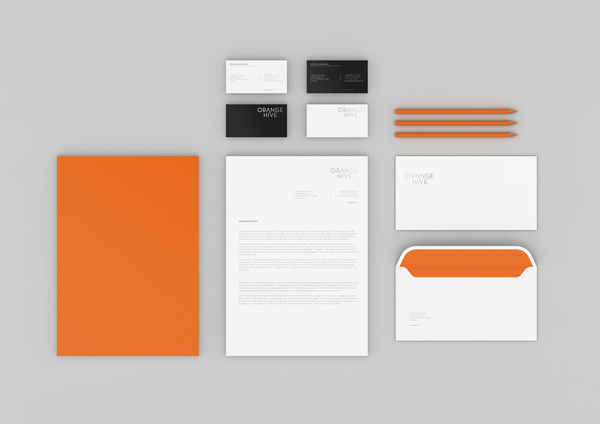
This one is made for a creative agency in Frankfurt. Typeface and the connection between the letters A and V are simply looks exactly right. The simplicity in everything from the letterhead to business card are pretty much harmonious. Also i liked a lot orange, white and black as main colors.


This book is for food lovers. Making the connection between buildings and food, it's an original one. The organic fits perfectly on top of the inorganic. I found this pretty fun.


Yamamoto walking on the salt.


This piece is called 'Saltwork' made by designer Motoi Yamamoto. When his younger sister died from brain cancer, the designer began to memorialize her in his labyrinthe installations of poured salt. The patterns are formed from salt refers to the three dimensional brain as an exploration of his sister's condition and wondered what would happen if the patterns and channels of the brain were then flattened. His works are visually fantastic to look at and also has a deep moral value in it.


I found these on flickr, fell in love with them. I have no idea about the technical issues in photography but when i look at these, they give me a sense of peace and refinement.


16 Kasım 2012 Cuma

Letterhead for cazyap

Last week we were asked to design several letterhead examples. They had to obey some rules, and of course they had to carry the message right away. There you go;