30 Ekim 2012 Salı


Pin Up is an example of traditional American bowling, diner salon. Think it directly reflects the sense of that conventionality and warmth thanks to red color and of course the rounded welcoming typeface. 


This is a part of an office (!). I don't remember which business they were in but surely this company is widely open to innovative and original ideas. This is one of the meeting rooms which i fell completely in love with. My love with the long red table, the lighting system and the surf boards is growing every minute. It would be wonderful if companies would spend more money on interior design and care more about the motivation and feeling of the employees like this one did. To sit in a meeting room like this i would be ready to do meetings every hour.


Now i'll probably seem like a smart ass because a year ago i almost didn't have an idea about what is good design and what is not. But now, the minute i saw this, it bothered me. A lot. I'm not a designer of course, at least not yet but still it gets to touch on my nerves. 


Since i have a 'thing' with geometric shapes, this typeface got me under its spell easily. This is a condensed sans serif typeface with a technical and geometric appearance to it. Typeface has a tough look, it gives a sense of power and to me it has a strong, unchangeable characteristic.


This branding is made for a luxury department store. At first glance it reminded me of Selfridge's probably because of the yellow color. Paperlike woman figure covers the interior surface of the packages. I like this because the design of the packaging is so simple the woman figure with red lips and make up balances the whole design. Everything is elegant and simply chic. 


Stranger&Stranger is a packaging design company who is specialized in alcoholic drinks. They always create innovative, wild bottle shapes, labels and packages. In every bottle and package they design they put a color, a soul and a character into them. They care about typography and its role in the whole design. Even i don't drink scotch i would buy these bottles immediately just to decorate the room.


25 Ekim 2012 Perşembe

little exercise _ creating association

Last week Elif Ayiter gave us an exercise for us to go little beyond. She asked us to pick three or more images having no relation or similarity by subject or looking means between each other. So we were asked to create an association between those images and to come up with a logo which would refer to all images. At first it seemed a hard task to do, because finding assocaiton between very unrelated subjects, images and to create a logo from that chaos wasn't the easiest thing to do. But then i realized that i didn't have to think 'logically' or wisely and then select the images. I decided to pick randomly and then create a relation out of them. So i started to look around in acemi çaylak's facebook page and i chose these three images that i thought i could come up with something.

#1


The whole process began with the second image. A boy in a military suite, standing next to his widow mother who is holding on to the empty military coat of her martyr husband; war summary. I don't know when or where this photograph was taken but it gets to convey the message to the viewer just in seconds. Little boy tries to act tough, to stand like a proud soldier, his mother seems to me that she barely stands. Her anger and her grief are directly transmitted to us through the objective of the camera. This photograph tells us the casualties of war, what it causes, what it lefts behind. When i saw this i directly thought of a camera which brought me to the first image. Very lastly i bumped into the last image giving a direct message to the viewer; smile. Then i thought of a company who takes care of families who lost their fathers, husbands, brothers in war. The company work internationally but would be based in Switzerland since it's the symbol of impartiality. Also the country leads the Red Cross movement and has a strong economy to support all attempt to preserve human rights. My fictional company has several offices in every continent. Finds families who have serious damages, economic or moral casualties and take them under its protection by providing a home if it's necessary, provide food and scholarships for children. Economic support is also provided by the company for the medical treatments and this fund will last till the family gets on its feet. The basic idea is to get these families out of the negativity and desperation war creates. Main goal is to put a little smile on the faces, a glitter on the eyes telling the world that they're ready to move on and live their lives no matter what. 
At first i thought of using a military patch in the logo but that would be a direct connection and we don't want that. Then i thought since its an international company trying to spread hope throughout the world, i drew a world and put cokes of tree in it implying the spread. Company's name is ActToChange.


#2


I wasn't sure if i went crazy with the exercise so i decided to give it another try with these images. I first noticed the sarcastic third image and when i saw the heroic grandma image i came up with a zombie protector company. I thought of a company who tries to protect people from zombie invasions in a certain town somewhere in the world. Most working employee would be the grandma. She is the hero in the town, when the company sees a coming danger they give the signal to grandma through the pipe and she moves. The general story could be like this; while mother and daughter having their meal the sound from the huge pipe is heard. Daughter asked her mother why the pipe was making that sound then the mother would reply as 'because zombies are coming, dear'. Mother is calm and happy because she knows that grandma would come in seconds and prevent bad things from happening. First thing comes to my mind, not surprisingly, a zombie face or creepy dead eyes. First i did some eye sketches and put a cross on them and the result of course was too cliché. Then i decided to combine the exclamation with the signal. Company's name is Zombileştiremediklerimizden Misiniz.


23 Ekim 2012 Salı


This one got an award, not a surprise. I think it's truly amazing. His eyes supports Darwin's theory in hundred per cent.  


This branding project is made for a coffee company. I'm not a big fan of this one. I don't really like the usage of the rounded fonts in coffee or chocolate brands. To me, it always seems like coffee branding must have an elegant, sophisticated vision. Also, don't like the logo. It looks like the designer couldn't come up with something original and just decided to put the coffee bean and make a splash around it. Don't find a strong relation between the splash and the coffee, so the whole design seems very forced to me.


Bones. Again. Think i'll always find bony designs somehow attractive. Design of this ill mannered skeleton is just fine; melting hand, the structure of the bones and the crossed red line are simply appealing.


La Cabane d'Henri is a bed&breakfast auberge in Quebec. I think Canadian designer did a great job by reflecting the warmth of the auberge by using the red color and wood. Originality of the typography catches the eye quickly, every single word plays an efficient role in the unity of whole. Nothing bothers my eye, putting A in L or writing D in a smaller way according to Henri are so harmonious with each other so that the client quickly feels the charm of the little hotel.


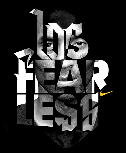
This Nike campaign with Kobe Bryant is made for the All Stars. Typography is so dynamic that it directly reflects the relentless energy of the basketball. Dynamism of the type and the calmness of the Kobe photograph balance each other in a way that deformed, in a way exaggerated typography doesn't seem too much to the eye. Yellow Nike logo is how it has to be in the first place, small, minimal, enough.


Tim Noble and Sue Webster build large scale sculptures made of haphazard clumps of discarded wood but when illuminated by a light projector create uncanilly accurate self portraits of the artists. I find this fascinating even to think about this project. Putting piece by piece and creating a figure is something so hard and requires millions of details.. Respect.


Refined beauty. Piece was created by stapling taunt strands of Egyptian cotton thread in a meticulous way. Never thought before combining millimetric threads would look this beautiful. Photographs are nice but still think that we can't understand the real depth and the sense of 3d without standing right in front of the piece.


Lastly, i put a video which was made by sound designer Diego Stocco. He carves trees and make his own custom instruments and calls this process Custom Built Orchestra. This is pure music.


17 Ekim 2012 Çarşamba


 Strassenfeger is a Berlin based magazine sold by homeless people. Rene Bieder decided to create an identity for them just to make a favor. I found the outcome very exciting, most striking part is of course the red triangle. The baseline of the magazine is so balanced that when you look at it you it just seems right in every way.


I fell in love with this Paris typeface. I know that it is a bit fancy but still i can't help myself loving the strikes, thick and thin relationship. It also does have a relation to the city. Carries the same old chic and elegance in my eyes.


This is probably the cafe where i would like to get my coffee and cheesecake while reading my newspaper in the sunny morning. The design is very basic but what makes it that attractive are the details, like in every case. Basic food and beverage shapes, minimal lamps and i must say i find the coffee machine very charming..


This concrete chair is Swiss made, surprisingly(!). I'm slowly starting to understand that i have a love affair with geometric shapes. Sharp edges get my attention in a minute. The idea of designing a chair from concrete is an original one. The visual of it is quite exciting to me, but of course i can't imagine anyone sitting more than 10 minutes on this one. Altough not functional, still i find it beautfiul.


I don't know anyone who haven't played Pacman in their lives. Pacman is so worldwide that is has become a symbol, a classic. Since we always see the one and only head, putting a body under the famous head is surprising and of course to writing down 'before his tragic accident' is simply clever.


I don't have any idea about who are these people or when this photograph was taken. Gentlemen create a unity thanks to their suits and moustaches but the actual reason i'm putting this here is, and i don't know if it's intentional or not but it's so unappropriate. Almost hysterical.


Office tools are always perceived as boring stuff. It's because they're in a office, don't need another reason. But this stamp is a pretty good one. Lets you choose what you are and it turns the whole experience into fun. 


Urban Tree Salvage is a company who designs one of a kind furniture from trees destroyed by urban development or disease. In the branding period, all the pieces were created from printed scraps, one color ink and wood. Reflects the message loud and clear to the client by creating an identity in peace with green.


9 Ekim 2012 Salı

Corporate Identity - Initial Ideas

This year our first project is to find out some fictional names for fictional sectors. We have to come up with some creative Turkish words which would look visually compelling to the eye. Here is a glimpse of what i came up with.


SECTOR I: F&B

Restaurant
1. MECNUN
2. EFLATUN
3. LATİFE

The concept
Delicious Turkish food made with olive oil. The amounts are little, so the recommendation would be to order many different kinds of food. For example; two pieces of steak with goat cheese, two plates of kısır, one plate of mash potatoes. The main idea is to taste all little by little while drinking a glass of wine. The customer will be sated with but will have the place for the delicious, original desert. The size of the restaurant will be small, probably only ten tables, to create a sense of intimacy and warmth. Every single piece that will be used have to be very subtle and minimal. The main colors will be beige, white, brown and navy.


Breakfast House
1. TAVADAN
2. RAFADAN
3. AĞAÇKAKAN

The concept
There will be only breakfast. The variety of cheese and jam will be very wide. The breads and eggs will be provided from precise regions. Everything will be, of course, organic and fresh. In weekdays the breakfast house will be open between 09:00-11:30, in weekends it will be 10:00-13:00. In the house, the regional impression will be felt and the clients will be having their breakfasts in a natural, fresh environment. The tables, forks, knifes and most of the used materials will be wood.


SECTOR II: Entertainment

Bar / Lounge
1.DERBEDER
2. ZELZELE

The concept
Opposite of the names, the bar will be a popular hangout for the middle aged people. The target range is working people aged between 25-45. The bar will be the place to relax where you have few drinks with your friends and meanwhile you can also meet some people from other sectors or who do the same jonas you do, who have the same interests as you have. This is the place where you can listen to new and fresh compilations of lounge music. The place will be open only between 19:00-23:00, because the main idea is not to get drunk or stay in a same place for hours and hours. The focus here is to make people have a good relaxing time.
This one is made by Sinan Büyükbaş. I liked this a lot just because it is very simple and also contains a bit of confusion which makes it so visually balanced. The letters are formed originally but at the same time legible. I find visually very attractive to put animal heads onto human bodies, and in this case it helps forming the unity with the text.


Those are illustrated water bubbles. Bubbles are always beautiful things to look at but this time they are even more interesting. This time, they give much more the sense of 3d, the viewer gets a sense of the depth and the several dimensions within the bubble. With the huge help of color these senses are aroused even much more comparing to the real life.


Polaroids are very characteristic objects, usually there is a story behind them which drags the viewer into it very quickly. This one is no exception. The solitude of men is a well known fact and sometimes it is a depressing notion. But to me this polaroid is nothing but refreshing.


When a designer achieves to put a smile into your face by doing something so basic and easy it is when all gets so excited. Here Daniel Kukla just puts a mirror and the rest is handled by the nature itself. The power of reflection of the mirror shows itself in a very subtle and elegant way.


Typography always excites. This one caught my attention cause it contains constructive elements. The pipe formed letters make a reference to the constructivist side of typography. The design of the poster functions pretty well thanks to the distribution of the elements which eventually shape the letter.


Loved this steel freaky necklace. Since steel reflects the light, the shadows which are shaped on the necklace make it even more remarkable.


This design of corporate identity works so well because of its simplicity. It delivers the message right away but at the same time it gives you a sense of curiosity by creating a strong bond between the letters T,A and D. That line forms the basic characteristic of the design which makes it compelling.


      Before the internet, TV was the mainstream, TV was the main 'thing'. We all know that TV in 21th
century is not really the most dependable source of information. From that, i find this play with the word television is an original one. Making television into tell lie vision seems so easy but gets to put a smile on my face. 


Simply adored this photograph. Putting an astronaut in a busy street is a compelling idea all by itself. Burning it is another intriguing side. He is walking down the street burning all inside out but looks like he is just fine with the situation, he goes along with it. I think the warm yellow of the headgear's glass and the fire brings an unexpected excitement to the boring busy street environment.